
Mastering Layout and Design
Mastering Layout and Design
Sign designers are artists, but not all artists are sign designers. The reason being is when an artist paints a picture there are hidden meanings and subtitle clues to the real meaning. When you are designing a sign you need large bold ideas that grab your audience attention and conveys that message with in one second. A common misconception in the art world is that of the requirement of “natural artistic ability” to create a great sign, but this is not true. A good design is a skill that can be learned and developed over time and practice into your own personal style. You will understand after reading this, that you can achieve success in design through time, practice and a few simple rules.
Rule 1: VIEWING AUDIANCE
To be successful in design first determine with your customer what the use of the sign will be. Ask the following questions: Are you directing, informing, or selling? Will the sign be temporary or permanent? Is it for indoor or outdoor use? What image do you want to project, whimsical or professional? A sign’s distance from view is a key factor before it is created. 100 feet requires a minimum of a 4” letter, whereas a 16” letter is readable from 350 feet away.
Next is viewing time is also very important. How long will people have to read the sign? Does your customer have a current logo? A great rule to follow is to use no more than seven words on roadside signs. When driving at 40 mph you only have 4 seconds to read the sign so minimal copy is important. People consistently put too much copy on a sign or vehicle and nothing stands out.
Rule 2: CONTRAST
Contrast allows us to distinguish one thing from another
Which option has more contrast?
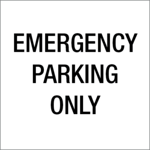
A B
Option B has more contrast. Contrast is key to making letters appear quicker. This is because of the darker background. Even with using the same two colors just flipping them around you sign can have much more impact you any view distance. When ever possible use a colored background, you message will twice the impact of a white background. Personally, I dislike white backgrounds. I try to use dark backgrounds and panels of color at least 75% of the time.
Rule 3: NEGATIVE SPACE
Here is a great trick I learned that is simple. Which box is easier to read, A or B?


Option A Option B
Most people think that option B is easier to read, but the opposite is true. White space is the key to good readability (Option A). Negative space is any area outside of and extending to the edge of the format; and within letters, illustrations, and logos. Negative space is seen with the subconscious when properly used. You will start seeing negative space all around you. Its purpose is to flatter the positive image.
Rule 4: LINE VALUE:
Contrasting line value is the comparison of thickness of line in letter strokes or illustration. Varying line value can make a sign more interesting to look at as well as be a useful tool to guide the eye to prominent points. Upper and lower case copy is always easier to read than all capitals. Block letters are easier to read than script font. The right choice of type style, size and spacing of lettering makes a big difference in the result. Add extra color and graphics to increase the appeal of your sign.


Lower case is easier to read. Heavy block font grab you attention first.
A line of upper and lower case letters is more legible and interesting to the eye than all capital letters. They also create a less formal, more “friendly” appearance.
Rule 5: FORMATING THE SIGN
Format is the shape and area of space in which you have to apply the copy, logo, and illustrations. Consider it a design component. It is a combination of related parts that can determine the quality of and how effective, a sign is. You see this in all advertising: vehicles, billboards, pop-up displays, etc.
For example take my three person rule: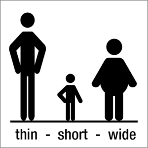
Who do you see first? The wide person this should be the main body, the big bold punch in the sign design. Next thing you will notice is the thin person. This will be your secondary copy, probably half the size of the main body copy. Finally, you see the short person this is your copy that isn’t as important but still necessary in the design. If you layout a sign in this format you will always grab you audience attention and you will convey the message with in one second.
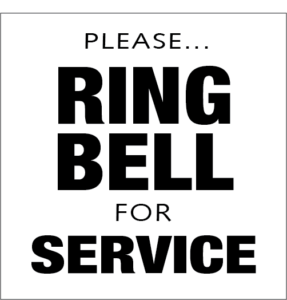
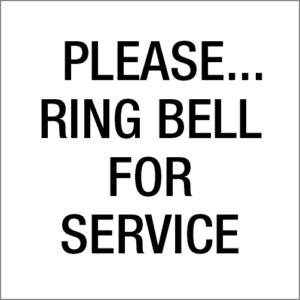
Rule 6: PRIORITIZING IMFORMATION
To translate copy, assemble into blocks or group ideas. These idea blocks may include several subjects or only a single subject. Best to keep copy blocks to a minimum. Prioritize the copy by telling people without any confusion, what they need and want to know. For example, what, when, where, why, and how much? It gives people direction, like my 3 person rule.
Example 1 is directing you to the bell, given that you are already in the parts department. Example 2 has equal emphasis on all words so nothing really stands out, does it?
1 2
Rule 7:RHYTHM
A clear, organized layout is the secret to success. One way to accomplish this is with rhythm. Rhythm brings the art together and makes it interesting to look at. If its balanced, it draws your eyes through the art. Conflicting rhythms tend to stop the eye and draw attention to the negative space we talked about earlier. Choosing fonts that coordinate will be rhythmically consistent to the design function.
Text alphabets are typically harmonious. Display alphabets tend not to be as well designed to flow as smoothly as text alphabets. Basically, any font that is easily readable is good for signage. Color is only one element of design, a decision to be made after you’ve formed your design groups and selected alphabets. Think of you design as a fancy meal, every element on the plate will complement each other.


Design 1: Design 2:
Which design is more appealing? Design 2.
Now it’s time to troubleshoot your layout by asking yourself a few questions. What is your first impression of the sign? Are there any areas of immediate conflict? Was correct importance assigned to each idea to relay the appropriate image? Does the overall arrangement create a pleasant silhouette? Is the line value consistent? Are the rhythms harmonious throughout? Do the alphabets work well with each other and remain consistent? Is the letter spacing compact enough to create the right amount of negative spacing? Do the colors convey the subject and work well together?
In conclusion, you will know you have a good layout when it appears clean, crisp, and fast. Consequently if you understand and apply the basic theories outlined here and dedicate the time and discipline to practice and hone your skills, you can become a great layout artist. Good luck!